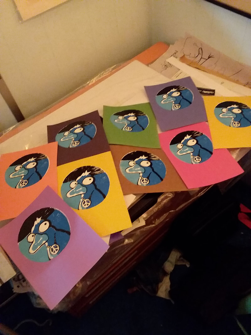
#trippytheduck
|
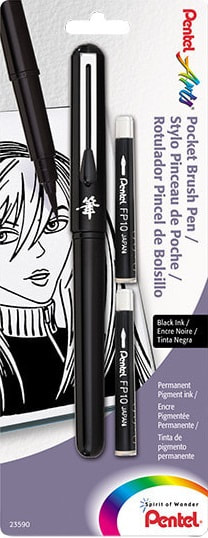
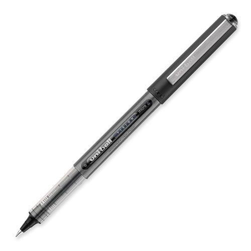
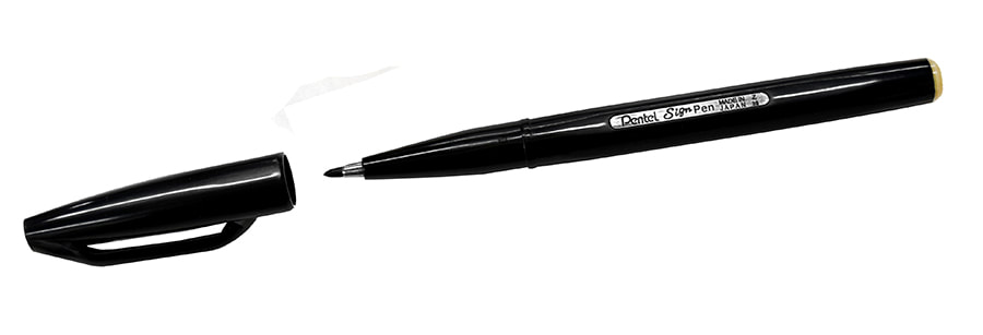
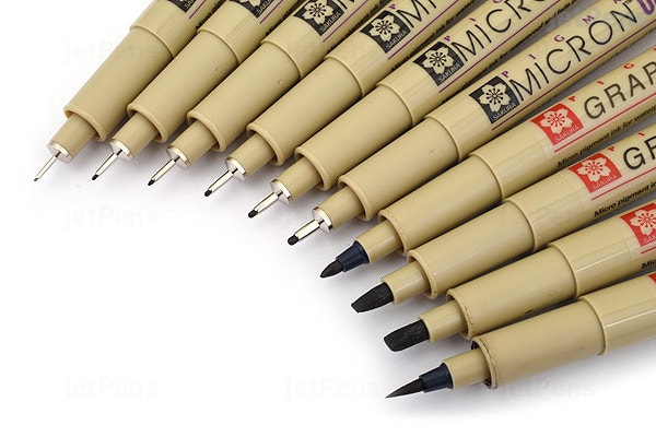
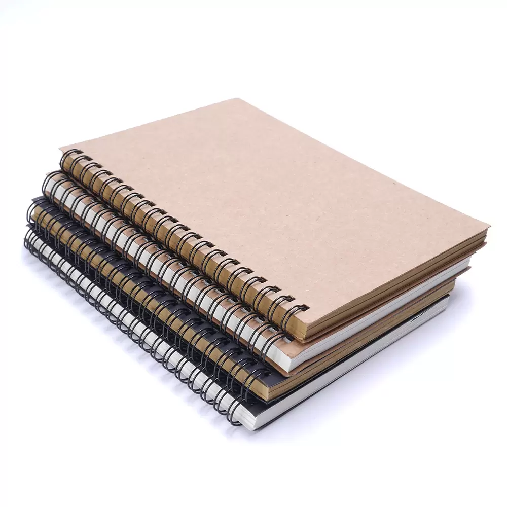
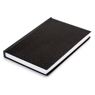
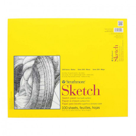
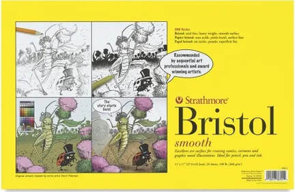
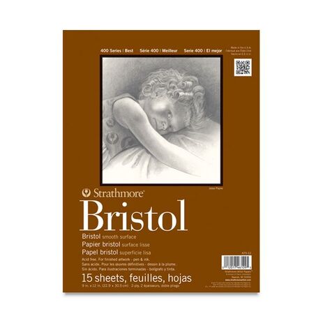
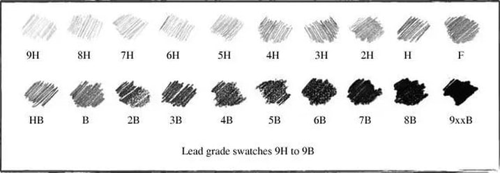
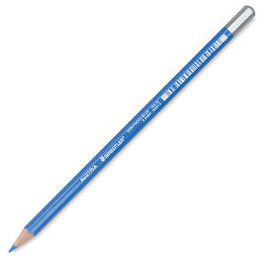
One of the ways I have been dealing with isolation is playing lots of YouTube videos, as background accompaniment, while drawing and painting stuff to try to sell on my Etsy page. One of my favorite YouTube channels is COMIC TROPES. This episode surprised me at several points. I noticed in this episode that, when Chris brings up the subject of Heavy Metal magazine, he states that it debuted in 1981. The magazine actually began publication in 1977. No biggie. I am requesting that people who have signed up for You Can Cartoon at Tsuga, bring the following three items: 1) A sketch pad or sketch book, ideally not too tiny. So maybe 7" X 10" or larger. 2) Any pens, markers, or pencils, appropriate for the paper. 3) A ruler or straight edge. A cheap plastic 12" ruler from the school supply aisle = perfect. One can use pretty much anything to draw with, from the thousands of options for pens, pencils, paper, and so forth. I like to avoid being pushy and particular about tools, on the one hand, because these things can be expensive. However, it is a legit argument that the special "pop" and "pizazz" which interesting work has depends to a degree on the "right tool for the job". As an example, a long-time popular brush that many cartoonists still covet is the legendary Winsor & Newton Series 7 sable. I use brushes pretty frequently and although I don't personally use the W&N Series 7s, I have a few Raphael 8404 sables, in sizes ranging from 0 to 2. If you can find any of these sable hair options, they'll usually set you back about 20$ or 30$. HOWEVER... Although sable hair has been a tried and true tool for cartoonists for many years, modern technology has provided us with many synthetic options which are quite acceptable, for a fraction of the cost. Not to spend all day on the subject of sable, the short version is this: So called Sable hair, which is used to make the Raphael 8404 series, the Winsor & Newton Series 7, and many others, comes from the tail of the Siberian weasel. Global climate change has affected how these hairs grow on these critters and the import and export of the hair itself is sometimes slowed by various red tape involving permits. And, naturally, a lot of us do not wish to be exploiting animals for such things anyway. The best thing I can recommend to you, today, here in lovely Seattle, is to consult your nearby art supply retailer, ask for the cartoonists on the staff, and get their advice on acceptable synthetic alternatives. Believe me, there are still many, many people who will swear up and down that you have to have sable. That's fine and I respect their opinions, but until you're getting commissions and have money to blow on such things, skip them for now. If you find all of this fascinating and wish to learn more of the story, click on this link Moving on... There is a particular refillable brush pen which, while expensive compared to other brush pens, is significantly cheaper than sable brushes, is synthetic hair, maintains an excellent point, travels easily (it comes with a cap, like most other pens) and is one of my favorite items in my travel sketching bag. I give you the Pentel Pocket Brush: Other pens I am fond of and use from time to time, are UniBall Vision, Pentel Sign Pens and Sakura Microns, pictured below. By the way, that last Sakura pictured on the right, with the brush-like tip, is the Sakura Pigma brush pen and that little item, although not refillable, is just about as cool as the Pentel Pocket Brush. Don't worry if you are unable to locate any of these particular pens. Bring what you can, as long as it's in working condition and if there are snags we'll resolve them together in class. You really just need to be able to make some lines on paper. Pens like these that I am posting images of, are typically available at stores like Artist & Craftsman Supply, An Artful Touch, Meininger, Dick Blick, Michael's, and sometimes at the office supply stores as well. I recommend that, whatever pen you select, it states somewhere on the packaging or on the pen itself, that its ink is water resistant and pigment based, not dye based. The reason for this is, you might draw a line you wish to correct by covering up with white and a non waterproof ink will re-wet and if dye based, do all sorts of unexpected color shifts and other weird things, which is great if you're Bill Sienkiewicz. Sketchbooks: A lot of artists like a wire-bound sketchbook because they lay flat: Another option is the classic "Black Book": Black books are stitch-bound, in small stacks known as "signatures", sewn into a hard cover, library book style. They're popular with artists from all walks and particularly with the hip hop graffiti crowd. You also have the option of using a pad. Pads come wire-bound or adhesive-bound. Pictured below is an adhesive- bound pad of Strathmore brand paper. Whatever you find yourself leaning toward, the paper should be smooth and appropriate for pens and markers. A few words on bristol: Bristol is not required for class but it's such a frequently used paper by cartoonists that I am compelled to mention it. Bristol paper, or bristol board as it is also referred to as, is a sturdy, all purpose fine art paper which comes in individual sheets as well as pads. Almost all pads of bristol are "2 Ply" which refers to the sheets' thickness. Individual sheets of bristol are available in thicker options and are larger, usually around 20" X 30" or so. Incidentally, bristol is the type of paper typically used for comic book art. Spider-Man, Batman, you name it...thousands of comic books' pages have been penciled, inked and lettered, on Bristol. Treat yourself to a pad of it and test it with all of your drawing pencils and pens. It's built to take it. The 500 series by Strathmore is what professionals use. I am happy saving a little money and use the 400 series myself. It gives me the results I'm after. Anyway... 1) Get a sketch book or pad YOU like. If however, you go with bristol... 2) Each series also breaks down into either smooth, a.k.a. plate or vellum, a.k.a. rough. The smooth surface keeps fine ink lines from spreading out and blurring. The rougher, vellum surface will sometimes work for ink lines, especially if its better quality, like the Strathmore 400 or 500, but it is really more appropriate for pencil, charcoal and watercolor. Click on the images below, to link to informative Strathmore videos: Sometimes people pencil an image prior to inking it. Previously, I had written a very wordy, long boring paragraph about pencils but then deleted it. All I need to to say about pencils is: get one with a hard lead. It breaks down like this: Notice how dark the result is from the softer ("B") leads. Personally, I like to use 2H or 3H and the reason is this: the harder leads are way easier to erase. The softer, blacker graphite like 6B, 7B and so on, are more typically employed in graphite pencil artwork, where ink isn't involved. Their deep rich black is gorgeous but erasing is difficult. Also, if you're sketching in a sketchbook that you carry around with you, and you've used soft lead, the lead is going to smear and smudge and look messy, unless you spray your sketches with fixative spray. A small can of workable matte spray fixative should do. The term workable means that the surface, even after you have sprayed, will continue to accept pencil. You won't be able to erase previous line work, however you can continue adding. There is a popular alternative to graphite, by the way, and one I use myself, the non-photo blue pencil. A Non-Photo Blue pencil is, as the name suggests, blue lead which does not reproduce when photo copied. There are a few different brands of non photo blue pencils available and pictured below is one made by Staedtler: I'm going to stop there for now. We can move onto all the other interesting options in class.
Art supplies is such a giant subject and the irony is that there are lots of cartoonists who have created their work using very few tools. Two wonderful examples I bring up frequently are the graphic novels My Favorite Thing Is Monsters by Emil Ferris and I Know What I Am by Gina Siciliano. Both of these books' artwork was drawn in ballpoint pen! We'll chat a lot about materials in class and I will demonstrate things like dip pen nibs and mechanical pencils and all sorts of things. Meanwhile, bring any paper and something to make marks with and we'll be off and running! A useful and entertaining exercise is to draw a figure without looking at one's paper. Usually, in drawing classes, the students observe a figure model and, keeping their eyes trained on the model, without looking at their newsprint pad, follow the forms of the figure model and draw them blind. This fun photo essay from a 1947 issue of Life Magazine, demonstrates the exercise although the participants' approach was different in that they were remembering instead of observing. Try it yourself both ways! And, as practiced during observational contour drawing in classrooms, try it without lifting your pen (charcoal, pencil, etc) off of the paper! You might not capture a satisfactory likeness but you might find your results interesting otherwise. For those of you for whom I have no contact information, I am afraid I yam sick! Bleah!! So sorry and we can all discuss how to make it up to y'all next week. Feel free to get a hold of me if you need. Thanks and a thousand apologies. -Chris
I will be switching some things around, dropping some things, adding others but I will be hosting another YOU Can Cartoon! series at Tsuga Fine Art and although the details will be forthcoming what I can provide for now is the dates and times:
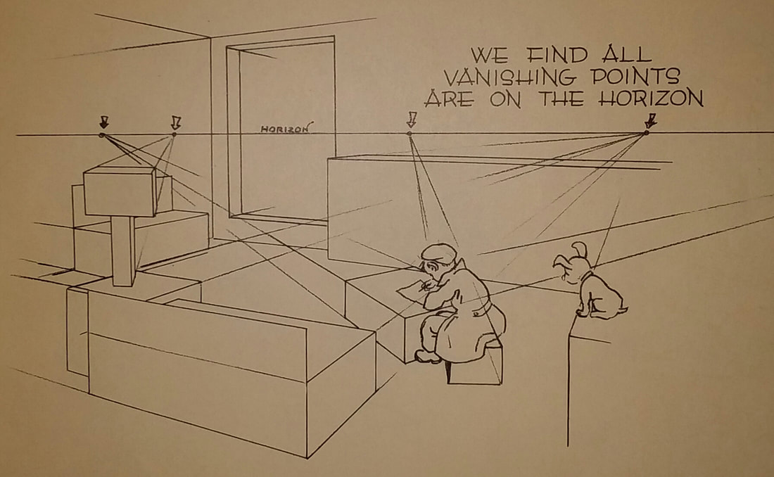
YOU Can Cartoon! Tuesdays March 10, 17, 24, 31, April 7, 14, 21 5:00pm - 7:00pm Here's an interesting documentary on Herge' I just stumbled across. :D The horizon, where sky meets earth, will always be at the artist's eye level, regardless of how high, low, or to the left / right the artist is positioned. Most items positioned in relation to that horizon line will be in two point perspective but there can be multiple items in a picture, each with their own single point, or, set of two points. Look at the diagram below, by Ernest Norling, and notice how the lamp-like object over on the left is nearly entirely presented in ONE point perspective, while the couches and end tables are in TWO point perspective, sharing those points on the horizon line, one visible to us, on the right, and the second lying outside the picture plane, on the left. There is a figure of a person seated at a coffee table rendered in its own two point perspective position, with, finally, their stool upon which they sit rendered in one point perspective. It can be tricky to accurately assess the horizon points which lay outside a picture plane. You may need to use various tools such as a yard stick, a pin stuck in the wall, etc.
The vertical lines have no vanishing point, they're just straight up and down. Three point perspective is not used quite as frequently but familiarize yourself with it for those sky high, bird's eye views of the city (think Iron Man flying down, looking down on New York's building roofs and the vertical lines of the buildings all converging on a single point, envisioned below the street surface) or a bug's view of a giant towering structure. There is no automatic indicator for the artist, telling them how far to the left or right to station points onto the horizon line, in two point perspective (haste in dropping in objects in perspective can cause them to appear squished or too stretched and just plain odd in relation to each other) so the beginner is advised to sketch from observed environment and employ perspective afterward, to tighten up the sketch, as an exercise. A handy way to make many images on paper look three dimensional is to imagine that they are contained within boxes. A lot of things one draws can be envisioned this way. And learning to draw a box in realistic perspective is quite easy. So imagine your subject boxed - in correct perspective (often "TWO point" but it could be one point) - in relation to your eye's horizon line. Look at your environment and try sketching it, at least the area roughly six feet in front of you and eight or ten feet to the left and right, observing the edges of tables, chairs and so forth, and notice how they all head toward a horizon line, regardless of whether you can see the horizon line. If there are other objects within this area, image them in boxes, with the boxes' edges similarly converging at their point(s) on the horizon. It appears that I will be teaching cartooning at Tsuga Fine Art again and I only have to decide on the dates for it. Wow, my humble gratitude is owed to Jay, Ken, Hannah, Tami, Betsy, Cleo, Izzy, Aria, Eligh, Thalo and Justin for being part of making YOU Can Cartoon happen at all! I am very grateful and I also plan to do some free materials demonstrations so check for those as well.
Despite the degrees to which human and other animal figures are exaggerated in cartoons, what hooks us in and generates our response is our either conscious or unconscious referencing of our own anatomical structure.
Familiarity with natural anatomy, coming from observation and sketchbook practice, enables the artist to enrich their work with dynamic form and communicate ideas more clearly. Building upon this foundation, the development of characters proceeds. In much the same way that we exaggerate details from our experiences to add humor or push a story, occasionally resulting in the "tall tale", we exaggerate our physiological form and movement to create interesting characters. Paul Bunyan, the legendary giant lumberjack, may be based on an actual person who lived long ago. This person may have been the biggest person around. Perhaps he was 6' 8" and 250lbs, within the realm of reality but why not, in the story, make him fifty feet tall!? Judiciously applied exaggeration helps drive interesting cartooning. Illustrate a story of a pillow fight but instead of just drawing figures swinging pillows at one another, draw lots of feathers sticking out of the characters' hair. Add an image of someone lying beneath a pillow with their feet up in the air and, off to the side, a broken lamp. Observe an elderly man in the park, feeding pigeons, as another hypothetical example. Draw him, observing how he moves in space and how the folds of his clothes operate, how weathered and wrinkled his face is, how the birds react to the move of his arm. Draw him being carried off by a bunch of these birds, while a young child silently watches, surprised. The caption should read: "We're out of peanuts! Just making a run to the store!". Can't come up with a character out of your head? Here's a jump start: Chop up pictures of people from magazines, separating their torsos, heads, legs, feet, etc. and toss it all up in the air. Assemble random parts together taping them together on the back. Now trace this being with tracing paper and a pencil. You'll see some amusing results. |
Archives
March 2024
|
 RSS Feed